Selected Works — UI + UX

CASE
STUDIES

A cross-section of platforms, clients, and challenges — translated into pixels with intent.

01
Origin
Why UI+UX?
02
Brand + Digital
A Powerhouse Client
03
E-commerce
Full Throttle Startup
04
.EDU Redesign
Univ. of Wisconsin
05
Non-profit Digital
Not Rocket Science
06
IA + Navigation
Kent State .EDU
07
iOS / Mobile
WOVN App
08
SAP Hybris
My Area of Expertise
09
B2B E-commerce
PDP: Perspective…
10
Identity
A Brainy Bespoke Logo
CHAPTER 01
01
Made to Make

Why UI+UX?

Origin Story  ·  Art → Design → UX

On Design

So, I designed this logo — it is simple yet nuanced; it clearly conveys a concept executed in a visual medium, and it invokes an emotional response.

But design, at its core, is simply "…anything not created by nature." That logo kind of screams nature, am I right?

If you break it down, it's basically an amalgamation of observational skills and mechanical intuition at play. Couple that with a keen interest in the nuances of the human psyche, add in a directive with an objective — and you're basically primed to become a UI+UX designer.

Design is the intersection of observation, empathy, and intent — applied with discipline.
African Finger Harp
Sunflower
Mask
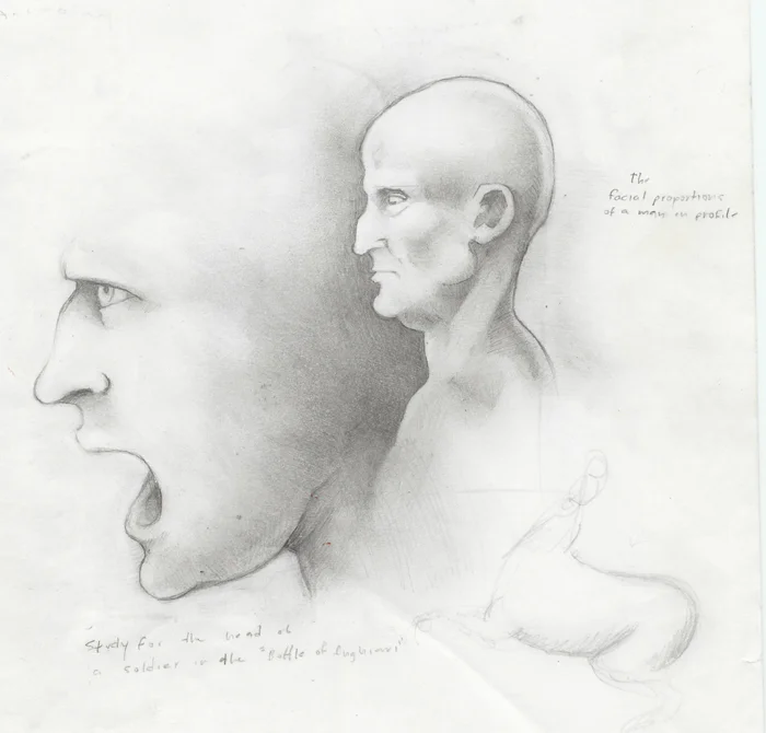
Da Vinci attempt
Art + Design

Art is creating. Design is discerning & dissecting.

You know, there's a reason they call it a "work of art".

10,000+ hours of micro-task UX optimization later, the discipline becomes instinct — could you imagine if Cy Twombly designed a website?

Ten thousand hours of craft don't just build skill — they build judgment.
UI · UX
Photography
Identity
CHAPTER 02
02
Building a Powerful Experience

A Powerhouse Client

Power HRG  ·  With 160over90 · Brand + Digital

The Brief

The cofounders had one very specific requirement: for it to be unlike anything or anyone else in the home remodeling space. Whereas most in their industry inventorize their services and product offerings, Power wanted to showcase the lifestyle benefits that come with achieving your dream home.

They wanted video. They wanted animation. They wanted lifestyle photography — and they had the budget and enthusiasm to see it to fruition.

The strategic mandate: move the market away from product listings toward aspirational lifestyle — and own it.
Power Hero

"Power is a _____ company"

"Rather than try to solve it with a single sentence, I suggested we try the opposite. The team at 160over90 liked it; the Power team loved it — so off we went."
Power home loop
Power animation
Cross-department coordination

The Works

The level of cross-department coordination was significant — nay, tremendous — with critical elements needed from everyone. I worked with the brand designers to advise design decisions that would translate into the digital space. I coordinated with photographers on on-site photo shoots. There was concept art that needed to be animated by the motion designers, and lastly — working closely with the video team to produce the video segments featured on the website.

There's a trick I learned from a copywriter at 160over90: "You need to craft a 'loaded sentence'; make every word count." Since I'm not really a copywriter, I just gave them a whole bunch of sentences.

— Shout out to the dev team. Okay, it was just Greg.

End-to-end creative direction across brand, photography, motion, and video — unified under a single design vision.
Team
Power transition
CHAPTER 03
03
A Fast Start

Full Throttle with a Startup

AmericanMuscle.com  ·  E-commerce · 2011

Ship It

It's a ton of fun to focus your efforts on a single product, especially when that product is the face of an e-commerce platform shipping millions of dollars of merchandise to a fanatical fanbase — derr, userbase.

With a need for a system that could accommodate thousands of uniquely complex online orders spanning a bevy of categories, I designed custom UI+UX solutions through iterative testing — everything from homepage through checkout, to your inbox. Or, in this case, your doorstep.

*The site has changed since 2011, but the fundamental building blocks are still largely intact.

A full-funnel e-commerce experience — from homepage to post-purchase — engineered to scale with a high-volume, category-complex catalog.
Mustang
"Test. Sell. Optimize. Sell more. Rinse and repeat."
AM Z Pro
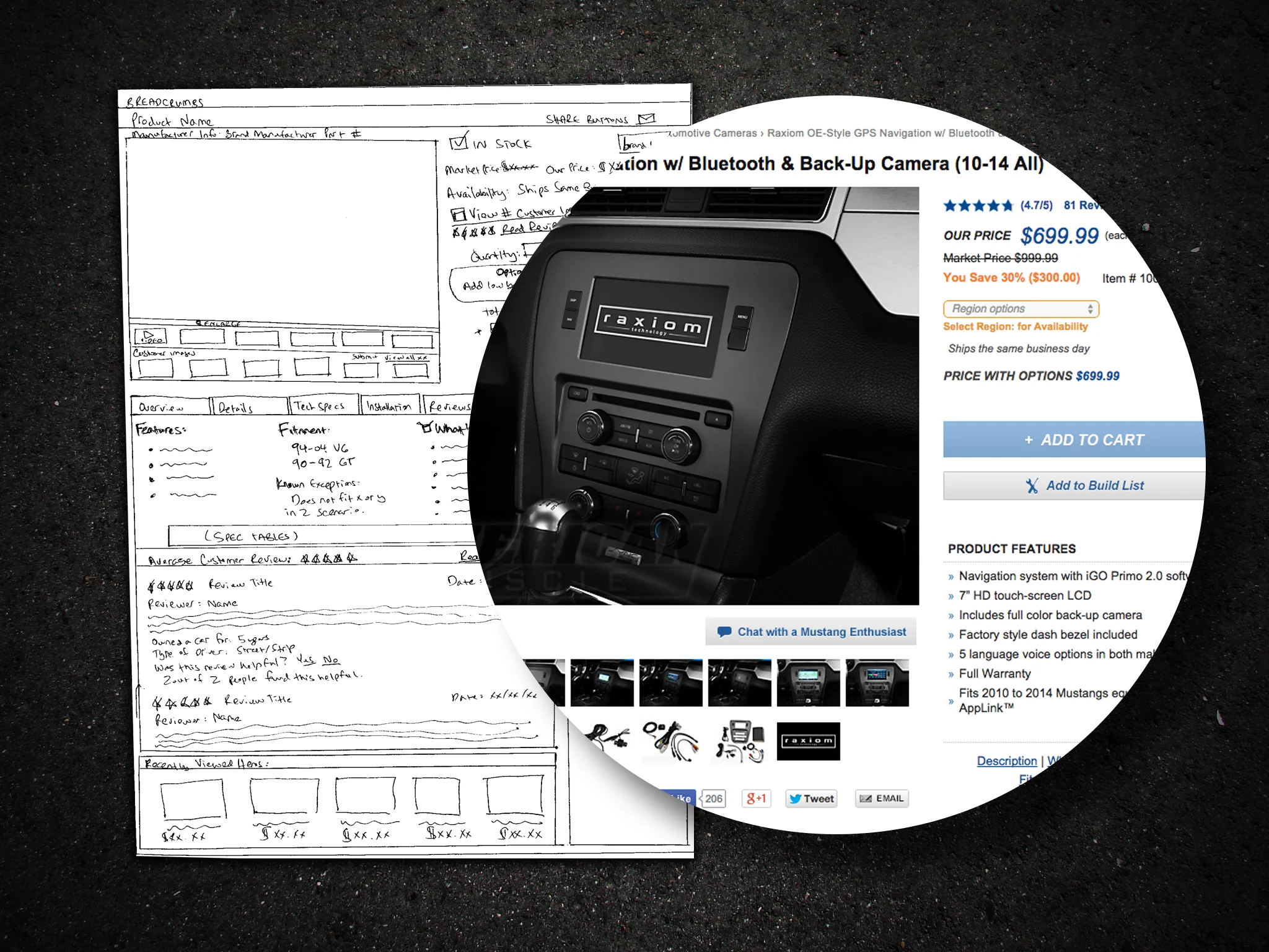
AM Wireframes
Mustang MM
Holistic Ownership

Besides the UI+UX, I functioned as the product photographer. So having a holistic hand over photography, the website, and branding, I was able to establish a cohesive design language throughout the website.

Essentially everything you see above — Raxiom logo included.

Unified ownership of UX, photography, and brand identity produced a coherent design language across every touchpoint.
UI · UX · Photography
Branding · Identity
Raxiom logo included.
CHAPTER 04
04
"Built Without Limits"

Univ. of Wisconsin–Madison

wisc.edu  ·  With 160over90 · .EDU Redesign

The Situation

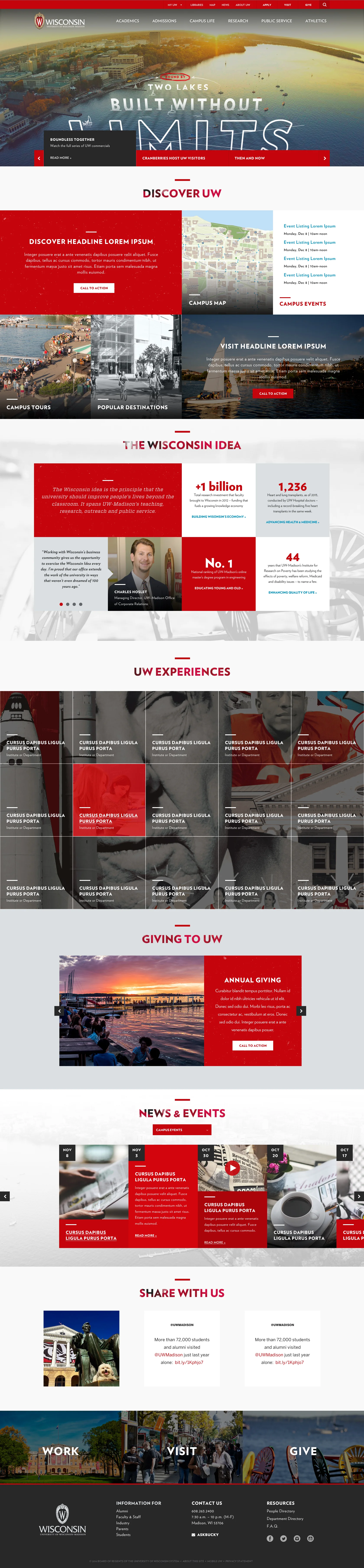
Okay — I realize these wireframes are basically grayscale designs. It was one of those unique situations where the university's team already had a solid IA in place and, with ambitious plans for the future — having just launched a massive rebranding effort — sought an upgrade for their .EDU.

When the client hands you their fresh brand and says "Wow us"... it's when things get exciting.

A freshly rebranded institution needed its digital presence to match its ambition. The brief: elevate.
Wisconsin Full
Wisc wireframe
Wisc styled
How We Sold It

Brand elements become systematic UX cornerstones.

We put together a web style guide, threw in a mixed bag of UI components, and walked the client through how key brand elements become systematic UX cornerstones in their website interface.

It really set us up for a one-to-one conversation. We talked about what they needed, what they wanted, and what they could get excited about — then asked if we could have some fun.

A web style guide and component library translated brand identity into a replicable design system — giving the client a clear, scalable foundation before creative exploration began.
Wireframes · Style Guide
UI Components · Brand Integration
Desktop → Mobile 1:1
Wisc mobile
CHAPTER 05
05
A 'Smart' Heads-Up Redesign

It's Not Rocket Science

dana.org  ·  With FlightPath · Neuroscience

No Refresh in a Decade

The Dana Foundation provides grants and funding for neuroscience research and education. The previous site hadn't seen a refresh in over a decade — making a near 1:1 desktop-to-mobile experience critical.

We delivered a full-spectrum mobile-first redesign — new brand identity, intuitive navigation, and a flexible layout for showcasing a comprehensive array of neuroscience content.

A traditional top-bar navigation was not going to work — and no way was I hiding these taxonomies behind a hamburger button. (…okay, okay — burgers are acceptable for mobile.)

A decade without a refresh demanded a mobile-first architecture that could surface deep, complex content taxonomies without compromise.
BAW hero
Nav animation
Dana image asset
Oh, btw — BAW

Two brands. One card system.

Dana Foundation has a subsidiary initiative called Brain Awareness Week — an outreach program for educating children and young adults.

My card-system interface accommodated both the business and content needs of dana.org and BAW with only modest adjustments to the CSS.

That said, BAW was much more technically demanding on the backend — go figure.

A single, flexible card architecture accommodated two distinct brand identities — maximizing design reuse while preserving each brand's integrity.
Dana mobile
Dana nav
BAW mobile
CHAPTER 06
06
A Navigation & Taxonomy Study

Kent State .EDU

kent.edu  ·  With 160over90 · IA + Nav

One Big Puzzle

Eight regional campuses, dozens of international locations, and multiple internal entities with unique priorities and initiatives. Given Kent State's breadth across the region and the world, I set out to develop IA and UI+UX solutions that accommodated their complex and atypical infrastructure.

I refactored their IA, created wireframe and design prototypes showing the intended functionality, and walked through various user-flow scenarios giving the client a clear understanding of form and function.

Additionally, I engineered a separate navigation system from the ground up. While it didn't make it to fruition, it served as an invaluable thought experiment in creative and analytical problem solving. — Shout-out to my developer for that insane implementation.

Eight regional campuses and dozens of international locations required an information architecture built to handle institutional complexity at scale.
Kent State hero
Kent nav
Kent nav detail
CHAPTER 07
07
Hands on with iOS

WOVN — an iOS App

O3 World  ·  iOS · Agile · MVP

Finally, An App

Most of my UI+UX experience had been for websites — I mean, responsive websites that you can view on your phone. But the expectations are different when you're handling a native app.

You can imagine how thrilled I was when I joined O3 World and was immediately presented with the opportunity to finally get my hands on app work — operating on an efficient 2-week sprint cycle with weekly face-to-face meetings with the client.
The app was privately funded by its founder, and we met with his team on a weekly basis. In a world where most meetings occur on the cloud, it was great having face-to-face time — direct feedback, working out solutions, and getting approvals in real-time.

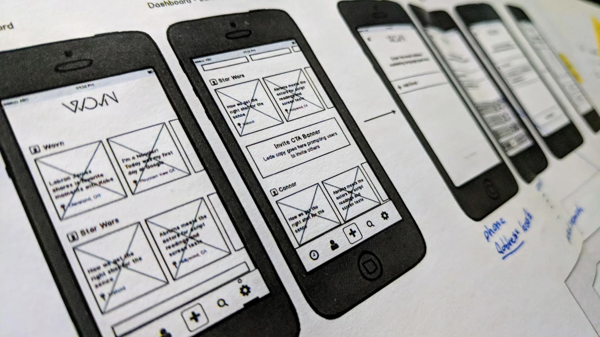
A native iOS product delivered on aggressive two-week sprint cycles — with direct client collaboration driving rapid, high-fidelity iteration.
WOVN tiles
WOVN approach
Scope
Account · Friends · Stories
Camera UX · Video
Auth Flows · MVP
2-week sprints
WOVN wireframes
CHAPTER 08
08
{My Area} of Expertise

This Is My Area

SAP Hybris · SFCC  ·  LiveArea · Workarea · WebLinc

Translating Data Into Pixels

One thing I excel at: translating data points into pixels. Having worked with client teams of all types through the years, I've developed a knack for translating their hard requirements into conversation pieces that make the creative process actually creative.

I may have spent as much time, if not more, in spreadsheets and word docs outlining technical specs, functional requirements, and UX specifications than I spent working on UI in Sketch.

Translating complex technical requirements into actionable design decisions is the connective tissue between business objectives and user outcomes.
Dana hero
"Rather than reading off an excel sheet and bullet points, I created a format that invited discussion and client engagement."

Cards Against Bad UX — the client enjoyed it, said as much on the call, and softly approved the first pass with just two small feedback adjustments.

Work detail
Work detail 2
Work detail 3
Rotating nav breakdown
From this to that
Workarea detail
Stories A
Stories B
CHAPTER 09
09
Perspective, Diligence, Payoff

PDP

HARDINGE  ·  B2B Ecommerce · SAP Hybris · LiveArea

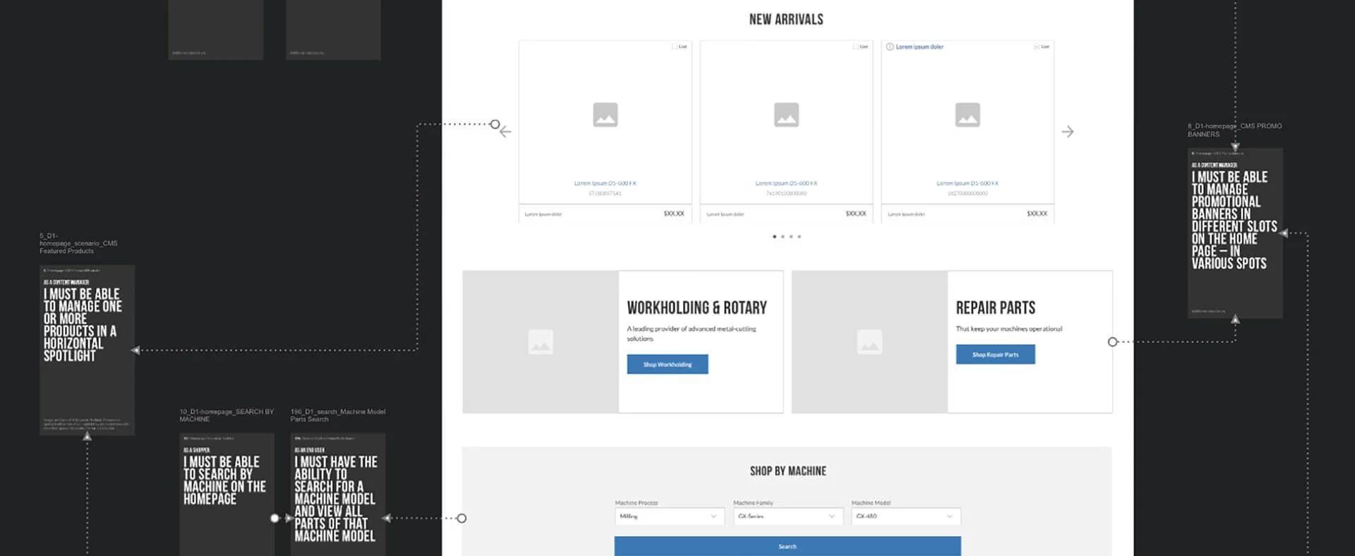
Board-Level Pressure

I was approached by the SVP Creative Director who stressed this was straight from one of the Board members — so the pressure was on to deliver my best. Onus was mine to dive into the SAP Hybris platform and weigh the system's features against the client's requirements.

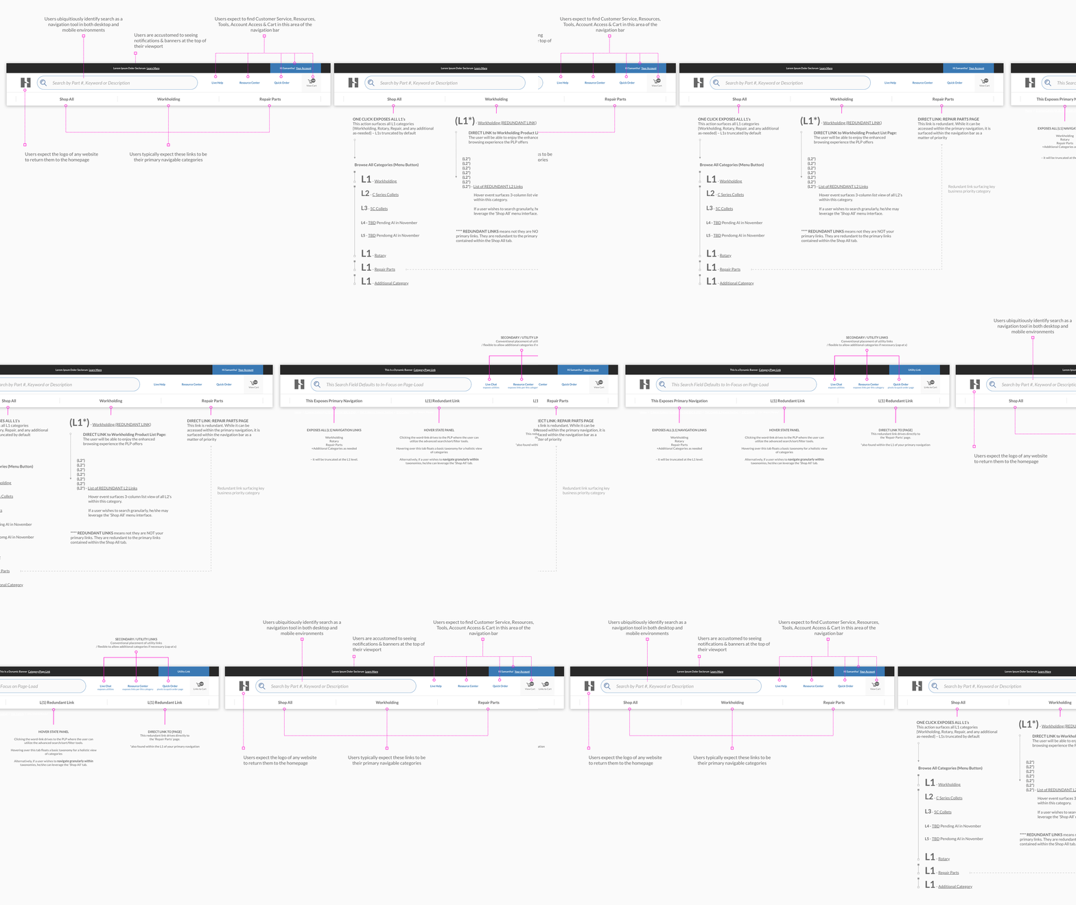
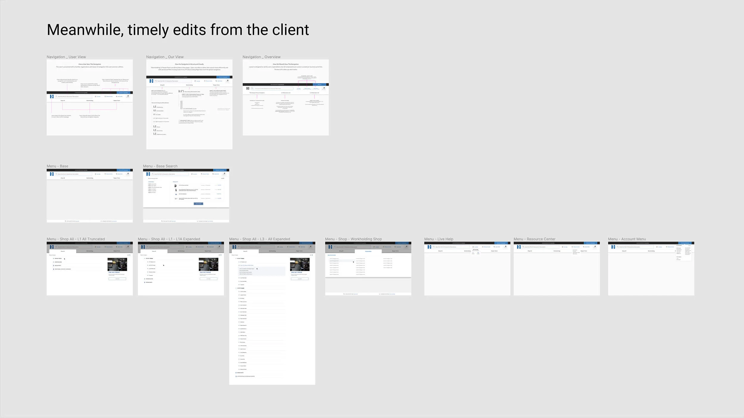
UX efforts ranged from iterating standard Order Lists, to designing complex data tables optimized for the layperson's mobile device, to granular documentation of micro-interactions throughout the sales funnel — add to that list navigation and taxonomy systems. My forté.

A board-level mandate on an enterprise B2B platform — full-funnel UX across order management, data tables, micro-interactions, and navigation taxonomy.
Hardinge hero
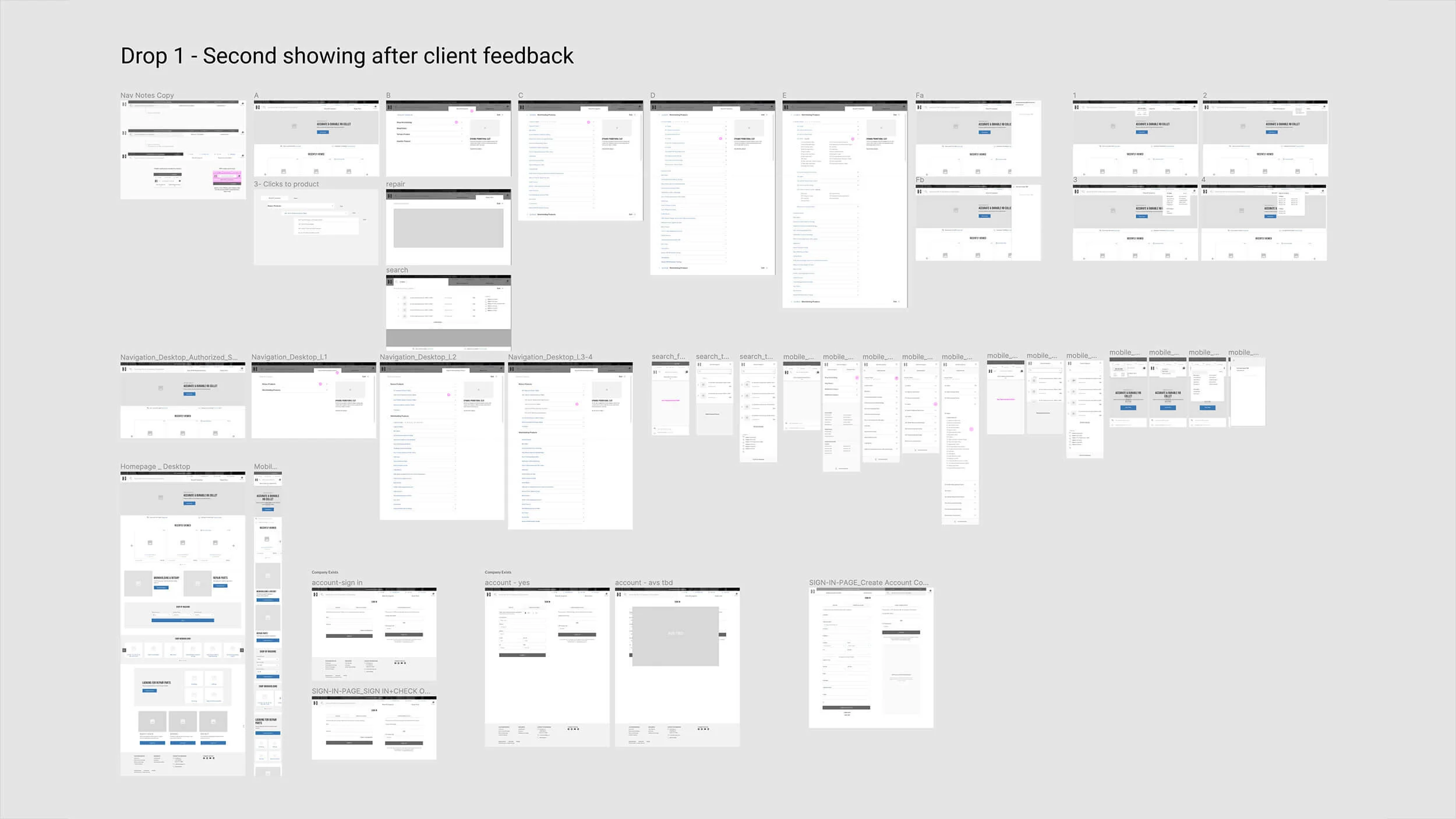
Drop navigation
Drop nav edits
Finalized nav
"I stayed up all night and made it happen."

Teammate insisted their version see fruition the night before the presentation. We showed theirs first. The client seemed pleased — then asked if we had anything else. Within minutes: enthusiastic approval.

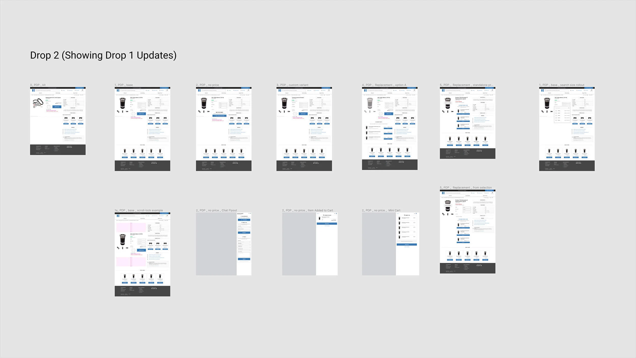
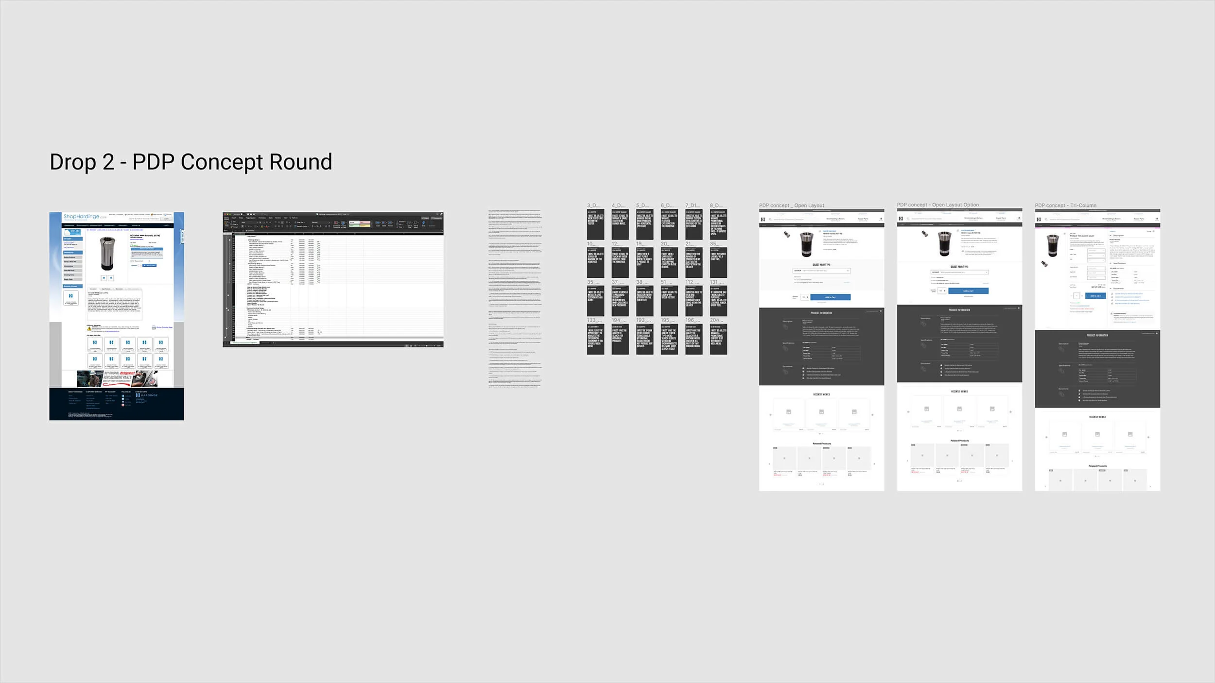
Drop PDP
My interpretation
Attention to Detail

It's not magic. It's caring.

There are some folks who diligently take notes on calls, and then there are others who are engaged in the call — gauging vocal inflections and reading between the lines of the often convoluted thoughts from the client's various contributors.

By leveraging human-centered soft skills, I consistently hit the mark within the first few passes. But it's not magic. It's maintaining full communication with the team; it's diving deep into a new platform; it's countless hours put in — not all billed — to make everything perfect. It's being patient despite egos, emotions, and exceptional deadlines. It's about caring about the work.

The highest-performing design work comes from listening beyond the brief — and investing in craft that may never appear on an invoice.
SA interpretation
Contact / closer
CHAPTER 10